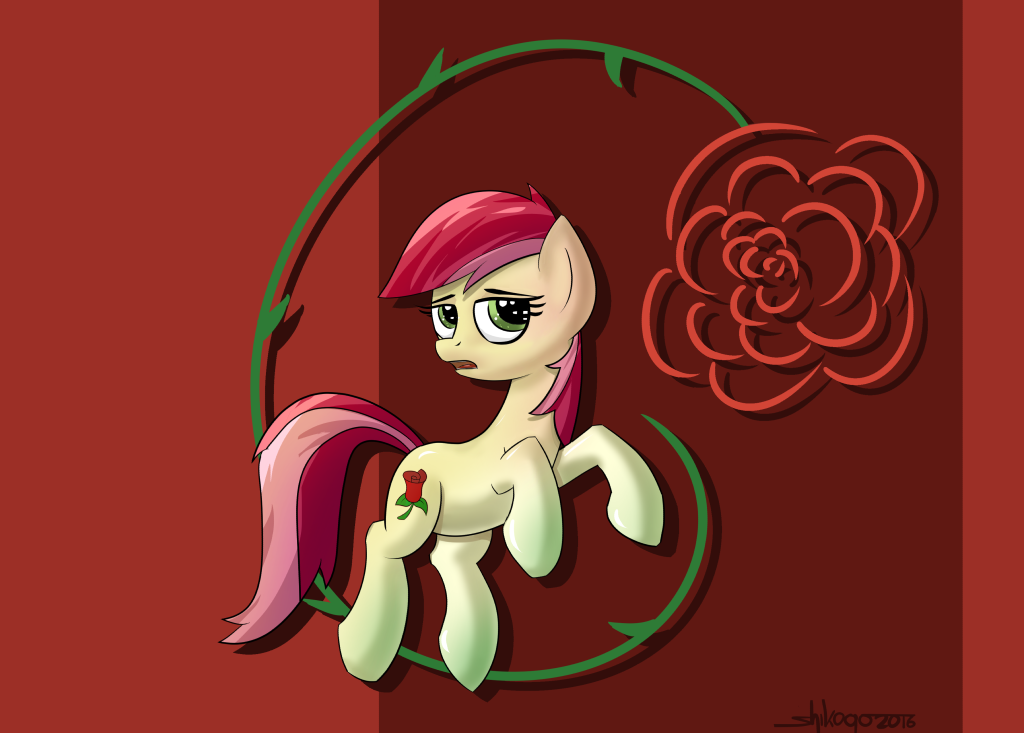
Alright, so let's start off by talking about the good aspects of this drawing. First, I like how the rose is given a shadow. Without it, there probably wouldn't be as much action going on in the photo. Also there seems to be a decent use of lighting in this photo, which I feel is a nice touch. Lastly, I find it interesting how Rose's hooves are lightly colored green. If you think hard enough, I feel like there's some symbolism you can interpret. Now there's the bad aspects of this drawing <img src="
e.deviantart.net/emoticons/f/f…" width="15" height="15" alt="
")
" data-embed-type="emoticon" data-embed-id="380" title="
(Sad)"/>. Firstly, Rose's expression doesn't seem that pleasant. It's as if she's unhappy about being on wallpaper. It kind of adds a gloomy mood to the piece. Second, the background doesn't have much action going on, despite the aforementioned shadow. On the left, you have this patch of medium red, then this huge chunk of dark red, and then a skinnier shape of light red. If you're going to have shapes in the background, I feel like there should be more than just three patches of red. How about some stripes, or some multiple chunks of red in different shapes or sizes? I mean, I'd find those to be more interesting than just three shapes. The shapes don't even have that much symmetry. The dark red shape seems to start one third into the left of the picture, then widens out until it nearly reaches the end. Maybe if it was placed right in the middle of the picture, then it would be complementary. Now the background shouldn't be too distracting from the main subject, though. It just to be enough to add some pizzaz. So yeah, I hate to be a little harsh towards this drawing, but I gotta give an honest opinion. If a little more work was done here, I think it would turn out really interesting. Keep up the good work, my friend!


![Roseluck [Collab]](https://images-wixmp-ed30a86b8c4ca887773594c2.wixmp.com/f/e0c91ebe-9624-4a17-9387-c237f3192598/dac62fd-30a70f31-8c96-4750-9738-f021cc2df16e.jpg/v1/crop/w_184,h_184,x_0,y_14,scl_0.047240051347882,q_70,strp/roseluck__collab__by_theotherdash_dac62fd-92s-2x.jpg?token=eyJ0eXAiOiJKV1QiLCJhbGciOiJIUzI1NiJ9.eyJzdWIiOiJ1cm46YXBwOjdlMGQxODg5ODIyNjQzNzNhNWYwZDQxNWVhMGQyNmUwIiwiaXNzIjoidXJuOmFwcDo3ZTBkMTg4OTgyMjY0MzczYTVmMGQ0MTVlYTBkMjZlMCIsIm9iaiI6W1t7ImhlaWdodCI6Ijw9MTM0MSIsInBhdGgiOiJcL2ZcL2UwYzkxZWJlLTk2MjQtNGExNy05Mzg3LWMyMzdmMzE5MjU5OFwvZGFjNjJmZC0zMGE3MGYzMS04Yzk2LTQ3NTAtOTczOC1mMDIxY2MyZGYxNmUuanBnIiwid2lkdGgiOiI8PTEwMjQifV1dLCJhdWQiOlsidXJuOnNlcnZpY2U6aW1hZ2Uub3BlcmF0aW9ucyJdfQ.YNL9JmWrliUBrKxsSXwBDIwYvd0J5TOdA3q3RaXD6mQ)
![Roseluck [Collab]](https://images-wixmp-ed30a86b8c4ca887773594c2.wixmp.com/f/e0c91ebe-9624-4a17-9387-c237f3192598/dac62fd-30a70f31-8c96-4750-9738-f021cc2df16e.jpg/v1/crop/w_92,h_92,x_0,y_7,scl_0.023620025673941,q_70,strp/roseluck__collab__by_theotherdash_dac62fd-92s.jpg?token=eyJ0eXAiOiJKV1QiLCJhbGciOiJIUzI1NiJ9.eyJzdWIiOiJ1cm46YXBwOjdlMGQxODg5ODIyNjQzNzNhNWYwZDQxNWVhMGQyNmUwIiwiaXNzIjoidXJuOmFwcDo3ZTBkMTg4OTgyMjY0MzczYTVmMGQ0MTVlYTBkMjZlMCIsIm9iaiI6W1t7ImhlaWdodCI6Ijw9MTM0MSIsInBhdGgiOiJcL2ZcL2UwYzkxZWJlLTk2MjQtNGExNy05Mzg3LWMyMzdmMzE5MjU5OFwvZGFjNjJmZC0zMGE3MGYzMS04Yzk2LTQ3NTAtOTczOC1mMDIxY2MyZGYxNmUuanBnIiwid2lkdGgiOiI8PTEwMjQifV1dLCJhdWQiOlsidXJuOnNlcnZpY2U6aW1hZ2Uub3BlcmF0aW9ucyJdfQ.YNL9JmWrliUBrKxsSXwBDIwYvd0J5TOdA3q3RaXD6mQ)